Furthermore, when considering logo size, it’s essential to balance the logo’s impact with the shirt’s overall look. A logo too large can overshadow the design of the shirt, whereas too small may make it unnoticeable and diminish its purpose. It’s about finding that sweet spot where the logo is both recognizable and harmoniously integrated with the shirt’s design, providing an optimal aesthetic result and maintaining the garment’s functionality and comfort. Understanding these nuances takes careful thought and a clear strategy, aimed at achieving the desired outcome for the shirt’s intended audience and purpose.
Understanding Logo Sizing for T-Shirts
When it comes to T-shirt design, I recognize that the size and location of the logo are pivotal for aesthetic appeal and brand recognition. Here’s what I have learned about optimizing these elements for impact.
The Importance of Logo Size and Placement
I’ve observed that logo size and placement on a T-shirt can significantly affect consumer perception. The dimensions of the logo can convey the brand’s message—larger logos are often used to make a bold statement, while smaller logos tend to be viewed as more sophisticated and understated. Placement is just as critical, as it determines visibility and alignment with the body. For instance, a logo positioned on the full front of the shirt garners maximum exposure, whereas the upper back or sleeves might be chosen for more subtle branding.
Standard Logo Sizes for Different T-Shirt Locations
I find it’s useful to follow standard logo sizing guidelines to maintain consistency and visual balance. Here are some conventional measurements:
- Full Front: A logo that covers the full front typically measures approximately 11 to 12 inches in width.
- Full Back: Logos on the full back also take up a large space, similar to the full front, maintaining the 11 to 12 inches width.
- Pocket: When designing for a pocket, logos usually fit within a 3.5 to 4 inches width range.
- Left Chest: The most common size for the left chest is between 3.5 to 4 inches wide.
- Center Chest: Center chest logos are slightly larger, typically around 7 to 10 inches wide depending on the design.
- Upper Back: For the area just below the neckline on the back, logos typically measure about 3 to 4 inches in width.
- Sleeves: Logos on sleeves generally keep within a 2-inch width for a standard look.
Keeping these sizes and locations in mind, I ensure that every T-shirt I design achieves its intended impact, striking the right balance between branding and style.
Design Principles for T-Shirt Logos
When designing logos for T-shirts, I focus on creating a visual impact that maintains clarity and integrity across various sizes. The logo must be versatile, easily understood, and identifiable at a glance.
Balance and Proportion in Logo Design
I ensure balance in my T-shirt logo designs by considering symmetry, asymmetry, and the weight of various elements. The artwork must not overpower the shirt but rather complement its form. Balance does not necessarily mean that elements need to be In the realm of apparel design, logo placement and size are fundamental components that can drastically influence both the aesthetics and the communicative value of promotional or branded shirts. When determining the appropriate logo size for a shirt, considerations include visibility, brand recognition, and the intended message the logo is meant to convey. While smaller logos are often seen as more professional and subtle, larger logos make a bolder statement and are more likely to catch the eye.
My experience in design has taught me that the context in which a logo is used should shape the decision on its size. In a professional setting, smaller logos sustain a sense of sophistication, while casual environments might allow for greater flexibility in logo proportion. For instance, a large logo emblazoned across a T-shirt can denote confidence and make a strong impact, which is especially effective for promotional events or specific marketing campaigns. This contrasts with corporate apparel, where a smaller, more discreet logo upholds a company’s brand identity without overwhelming the garmentof equal size but that they distribute visual interest evenly. To achieve this:
- Symmetrical Balance: I place elements of the design equally on both sides of a central line. This creates a formal and ordered appearance, reassuring to the viewer.
- Asymmetrical Balance: By using contrast and variety, I can create dynamic and casual designs while still attaining balance.
I keep the logos scaled appropriately, with most designs falling within a maximum print area of 12 inches wide by 14 inches tall for adult-sized shirts. For children’s sizes or designs meant for the sleeve or pocket, I scale down accordingly.
Choosing the Right File Format
For T-shirt printing, the choice of file format has significant implications on the final output. I prioritize vector formats such as EPS, PDF, AI, and SVG because they retain quality at any size and are ideal for intricate logo designs.
- Vector Formats:
- AI (Adobe Illustrator): Perfect for intricate designs that might require scaling or edits.
- SVG: Suitable for web use and scaling without losing detail.
- EPS: A staple for designers, easily compatible with various programs and print-ready.
- PDF: Offers versatility while maintaining design integrity.
In cases where vector formats are not available, I resort to high-resolution raster formats, such as PNG or TIF, ensuring they are at least 300 dpi to prevent pixelation when printed.
- Raster Formats (minimum 300 dpi for quality printing):
- PNG: Provides a transparent background which is useful for logos that overlay on varied fabric colors.
- JPG: Common and compatible with most programs, but lacks transparency.
- GIF: Not recommended for printing due to color limitations.
- TIF: Good for high-quality prints; however, file sizes can be large, making it less practical for transfer.
When saving my designs, I always check with the printer for their preferred format to ensure compatibility and the best quality print.
Technical Aspects of T-Shirt Logo Printing
In my experience, two fundamental aspects determine the quality and effectiveness of t-shirt logo printing: resolution and image quality, as well as color considerations. It’s crucial to understand these technical elements to ensure a sharp and vibrant print on any garment.
Resolution and Image Quality
When preparing a logo for print on a t-shirt, the resolution is paramount. I recommend using an image with a resolution of at least 300 dots per inch (DPI). This ensures that the final print is clear, without any pixelation or blurring:
- Resolution Standards: Aim for a 300 DPI print resolution for clarity.
- Image Type: Vector files (.AI, .EPS) maintain quality regardless of scale.
- Image Resizer: Use software like Adobe Photoshop (PS) to adjust resolution without compromising quality.
These steps lead to a high-resolution print that reflects well on the quality of the brand.
Color Considerations for Print
Color is another critical aspect. I often use the RGB color model when designing on a computer, but for printing on t-shirts, it’s important to convert the logo to CMYK. This color mode is used by printers and ensures color accuracy:
- RGB to CMYK: Convert your digital design from RGB to CMYK before printing.
- Print Preview: Check colors using a CMYK color profile to see how they’ll look when printed.
With these considerations in mind, logo printing will result in vibrant and accurate representation on various fabrics.
Screen Printing and DTG: A Comparison
In this section, I’ll provide an analysis of screen printing and direct-to-garment (DTG) printing techniques, focusing on how these methods apply to t-shirt printing.
Screen Printing Method
Screen printing, a technique I’ve found to be popular for bulk orders, involves creating a stencil (the screen) and then using it to apply layers of ink on the printing surface. Each color is applied using a different screen, one at a time, combined to achieve the final look. Due to the setup required for each color and design, I’ve observed screen printing as most cost-effective for larger batches where the costs can be spread out. Additionally, screen printing inks are typically thicker, resulting in vibrant colors that stand strong on dark fabrics.
- Type of ink used: Plastisol or water-based inks are common.
- Fabric compatibility: Works on a variety of fabrics.
- Color vibrancy: High — especially good for bold graphics.
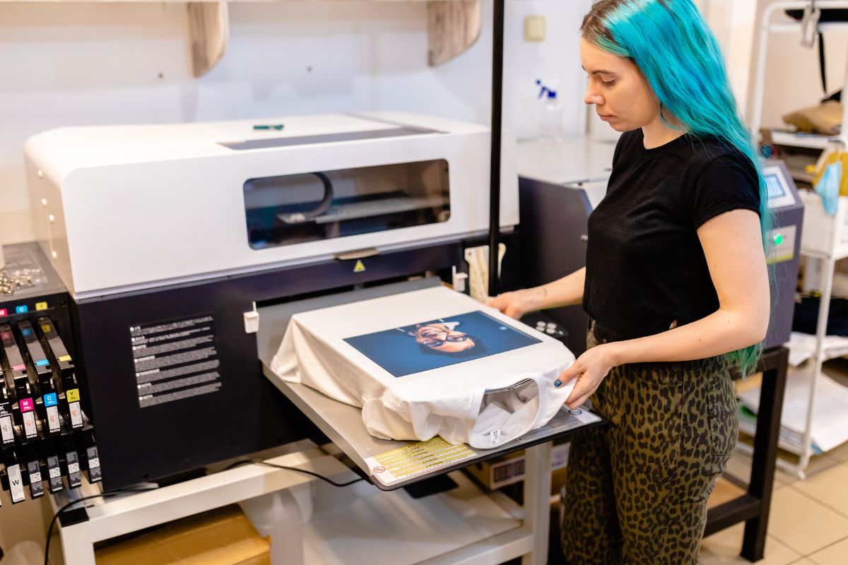
Direct-to-Garment Printing Technique
Direct-to-garment printing, on the other hand, is a newer method that I’ve seen being likened to a paper printer, but for clothes. DTG involves the ink being directly applied to the fabric and absorbed by the fibers. This method allows for more detailed designs and a softer feel on the shirt. As there’s minimal setup time, DTG is better for small batch orders and designs that contain a multitude of colors or complex patterns.
- Ink color process: Uses CMYK ink colors and can produce a wide color spectrum.
- Heat transfer: The ink is cured through a heat process.
- Detail accuracy: High — capable of printing intricate designs.
By comparing these methods, you can choose the most suitable one based on your t-shirt design requirements, quantity, and the fabric used.
Effective Logo Placement on T-Shirts
I understand that logo placement on t-shirts is crucial for visibility and brand recognition. Having your logo in the right spot can distinguish your shirt design as professional and desirable.
Popular Print Locations on T-Shirts
Center Chest: The most traditional location for a logo is the center chest, with an optimal print size of around 10 to 12 inches wide to ensure visibility without overwhelming the shirt’s design.
List of Preferred Print Locations:
- Left Chest: Ideal for smaller logos, typically 3 to 4 inches wide, similar to where a pocket would be placed.
- Full Back: A large canvas for more detailed logos, often 12 to 14 inches wide, placed between the shoulder blades.
- Sleeve Print: Often used for secondary branding, logos here are usually 2 inches wide, placed either on the upper arm or the wrist area.
Navigating Placement Options with Templates
Using a template is key to standardizing the logo placement across various t-shirt sizes. I recommend:
- Obtain or create a placement template that marks the standard logo positions.
- Lay the template onto the t-shirt to mark the correct position for the print area before printing.
- Use the template as a guide during the actual screen printing or digital printing process to ensure consistency across all shirts.
By carefully considering the placement options and employing templates, I ensure that the shirt logo placement is both professional and effective.
Designing Logos for Various T-Shirt Styles
When I design logos for t-shirts, considering the sleeve length and the desired impact of the logo size is crucial. These factors deeply influence the aesthetic and functionality of the shirt.
Custom Designs for Long Sleeve and Short Sleeve Shirts
For short sleeve shirts, logo placement is typically focused on the chest area or across the full front. The maximum size for a chest design is usually about 4″ x 4″, ensuring the logo is visible without overwhelming the shirt’s design. In contrast, long sleeve shirts offer additional space along the sleeves for smaller, elongated designs. Designs along the sleeve can extend up to 2″ x 11″, allowing for creative branding opportunities that run down the arm.
Adapting Logos for Oversized Printing
When tackling oversized printing on t-shirts, I approach the design with the intent to make a statement. Oversized prints can cover the entire front or back of a shirt and are particularly impactful on custom t-shirts. To ensure the design is not cut off, I keep a safe area with the maximum size typically around 11″ x 17″ for a full front or back design. This size works well for both short and long sleeve options, allowing for a bold display of the logo that’s both visible and tasteful.
Digital Tools and Resources for Logo Creation
In my experience, the correct selection of digital tools can significantly enhance the process of creating and resizing logos for apparel like shirts, ensuring they maintain clarity and impact at any size.
Utilizing Professional Design Software
For logo design, my go-to software is typically Adobe Illustrator. As a vector-based program, it allows me to create logos that are scalable to any size without loss of detail—a crucial feature when considering logo sizes for shirts. Illustrator’s wide range of tools and features give me precise control over every aspect of the logo creation process, including:
- Vector editing: Perfect for creating scalable designs that retain clarity at varying dimensions.
- Artboards: Helpful to design logos at different sizes and see them side by side.
- Type tools: Essential when incorporating text into logos, offering a vast array of fonts and typographic settings.
Free Tools for Logo Design and Resizing
When budget constraints make professional software like Illustrator less accessible, I often recommend free logo makers. These tools are incredibly helpful for startups or individuals venturing into logo design:
- Vectr: It’s a simple yet powerful web-based vector software, suitable for lightweight design tasks.
- Inkscape: Free and open-source, it provides a good range of vector editing features comparable to Illustrator.
For resizing logos specifically for shirts, these tools provide basic functionality:
- Proportional scaling: Ensuring the logo maintains its aspect ratio when resized.
- Export options: Vital for saving logos in various file formats which are necessary for different printing techniques.
I often advise using these free tools as a stepping stone, learning the foundations of logo design before investing in more advanced, paid software. They are an excellent way to get familiar with graphic design principles and logo creation methods without the financial commitment.
Logo Consistency Across Different Platforms
In order to ensure brand recognition and integrity, it’s crucial that I maintain a consistent visual representation of my logo on all platforms, including apparel, social media, and websites.
Maintaining Visual Representation Across Media
When dealing with various media types, from printed T-shirts to digital displays, the logo’s visual consistency is paramount. It is essential to have a standard set of guidelines that dictate the logo’s size, color scheme, and placement. For instance, on clothing, my logo should be immediately recognizable, whether it’s on a small label or emblazoned across the chest of a shirt. This means keeping the logo proportions and colors consistent regardless of scale.
For printed materials, I ensure that the logo maintains its integrity by providing clear instructions on its application, including minimum sizes and the avoidance of any alteration that might distort its appearance.
Adapting Logos for Website and Social Media Use
On digital platforms, the challenge often lies in the diversity of display dimensions and contexts. For my website header, the logo must be versatile enough to be visually effective and legible at different screen resolutions.
Website Logo: In the website’s header, my logo is presented at a size that ensures it is one of the first elements noticed, while not overwhelming the overall layout.
Social Media Icons: For platforms like Instagram or Twitter, the logo must be simplified to serve as an icon that is legible even at the smallest display size. This might mean adapting the logo into a single graphic element without text or stripping it down to a monogram.
Here, I maintain a master file with various logo formats designed specifically for different platforms to keep my brand’s visual representation consistent across the board.
Frequently Asked Questions
When designing graphics for t-shirts, it’s crucial to understand the common specifications for dimensions, resolution, and sizing. It ensures that the designs look professional and are clearly visible when printed on different shirt sizes. Here, I’ve compiled the most frequently asked questions to help guide you through the logo sizing process.
What dimensions should a full-front shirt graphic have?
For a full-front shirt graphic, the standard size is typically around 11 to 14 inches wide by 11.5 to 12.5 inches tall. This ensures the design is visible and impactful without overpowering the shirt itself.
What is the recommended size for a logo on the left chest of a t-shirt?
A logo on the left chest of a t-shirt should generally be about 3.5 to 4 inches wide. This is large enough to be readable without being too imposing on the garment.
How large should a design be for effective t-shirt printing?
The design should be large enough to be clearly identifiable from a reasonable distance. Most effective t-shirt prints for standard designs are at least 12 inches in width, which allows for details to be seen clearly.
What is the ideal resolution for a t-shirt graphic in pixels?
For a t-shirt graphic, I recommend using a resolution of at least 300 dpi (dots per inch) to ensure that the image is sharp and clear when printed. For a full-size design, this usually translates to an image that’s at least 3600 pixels wide.
What proportion guidelines should be followed for t-shirt designs?
The proportions of a t-shirt design should maintain a balance between the size of the design and the size of the shirt. Typically, the graphic should occupy about 60-75% of the shirt’s printable area to achieve a harmonious look.
How do you determine the correct graphic size for different shirt sizes?
When determining the correct graphic size for various shirt sizes, it’s important to scale the design proportionally. A common practice is to reduce the size of the design by approximately 10-15% for smaller sizes like S or XS and to increase proportionally for sizes larger than L to ensure consistent visibility and aesthetic appeal across all sizes.